Change the Hamburger Button Color in Squarespace With CSS
Do you know the three lines you select on a website (usually on mobile) that, when selected, display the website’s navigation?
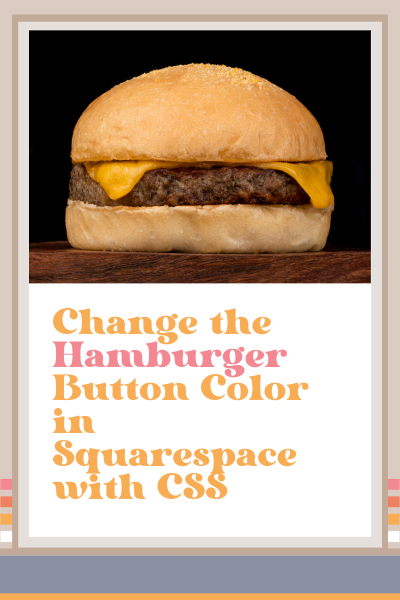
Well, that button is called a ‘hamburger,’ get it? The top and bottom lines represent the bun, and the middle line represents the burger.
Anywhoo, that thing is called a ‘hamburger,’ and if you want to change the color of the hamburger button on mobile in Squarespace, you need to use custom CSS.
I know this seems weird like there really should be a way to do this in Squarespace, but I can’t seem to find it, so I did a little Google search and found a code snippet to make it happen.
Watch me do this in the video tutorial below or simply follow my easy instructions below the video.
How to Change the Color of the Hamburger Icon in Squarespace
I was working on a website recently and noticed that the hamburger button was barely visible on mobile.
I assumed there would be an easy way to change its color in Squarespace, but I was surprised to learn that you can’t.
If you want to change the color of the hamburger button in Squarespace, you have to use custom CSS. (This is as of today 1/9/24).
The good news is that this is really easy to do!
Scroll down for the instructions.
This is How You Do It:
Login to your website and select Website > Website tools > Custom CSS
Copy and paste the code below
Change the color by highlighting the word ‘red’ and putting in the hex code of the color you want to change it to
/* Change color of hamburger button */

.burger-inner > div {
background-color:red !important;
}
Was this helpful?
Have you ever used CSS? Do you have a favorite code snippet you like to use? Tell me about it in the comments. 👇
This page contains affiliate links
Like this post?


