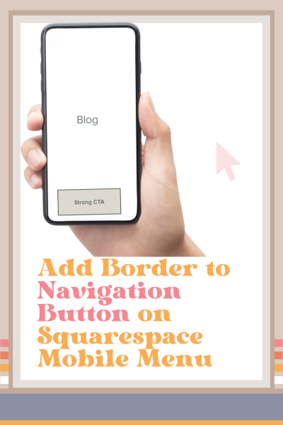
Add Border to Navigation Button on Squarespace Mobile Menu
How to Add a Border to the Navigation Button on Squarespace Mobile Menu
You may have noticed that when you go into the site styles of your Squarespace website and you select Buttons > Outline > Apply to all button types, that it doesn't apply to the button on the mobile menu.
If you want to have an outline around the button on your mobile menu to match all of your other buttons, you have to add some custom CSS.
I am a stickler about having my strong call to action look the same and have the same text on it throughout my website because it’s my website's job to attract and engage my target audience. Therefore consistency with my strong CTA throughout my website is really important.
And before you get too caught up in the design of the Squarespace website you’re working on, be sure the check out website strategy blog posts before you leave so that the Squarespace website you’re working on right now will have a strategy to attract and engage its target audience.
Add an Outline to the Navigation Button on Mobile in Squarespace
In your Squarespace website, open up the mobile view and select the mobile navigation menu.
Now go to Pages > Custom CSS and copy and paste the code below (scroll down) right here.
Change the hex code to the color that you want the outline to be and hit save.
Code Snippet to Add a Border to the Navigation Button on the Mobile Menu in Squarespace
/* Add outline around CTA button mobile menu*/

@media screen and (max-width:991px) {
	a.btn {
		border: 2px solid #000 !important;
}
}This page contains affiliate links
Like this post?


